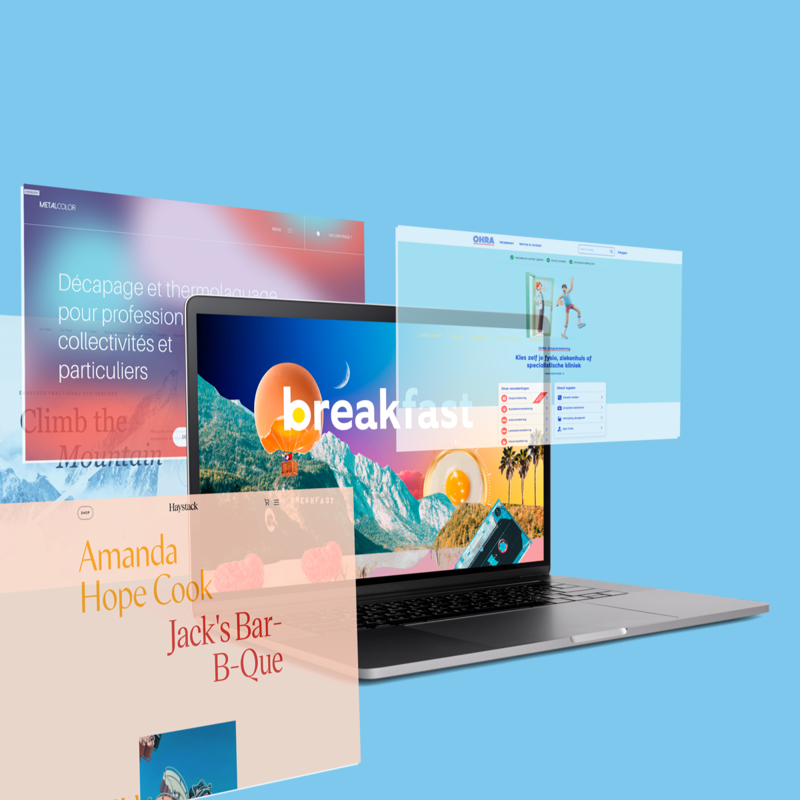
Web design 2023: eight cool trends
2023 will also be buzzing with trends in the field of web design. We share some cool ones with you. Stylish, colorful, daring, but above all personal and authentic.

2023 will also be buzzing with trends in the field of web design. We share some cool ones with you. Stylish, colorful, daring, but above all personal and authentic.
We wrote about this trend before, in 2021 and 2022. Now, web designs in dark mode are no longer an exception and the trend has conquered a place in web design. The dark mode has several advantages. Practically speaking, it helps reduce eye strain. From an aesthetic point of view, dark mode contributes to an ultra modern, stylish look. Additionally, you can emphasize other design elements by darkening the surrounding design. Win win.

Overall, we expect more color in 2023. Some trend watchers predict subdued online color palettes. Others predict dopamine colors, bright colors that evoke joy, following the colorful fashion trend of dopamine dressing. We also see striking neon colors, often in combination with a dark website. It is important that the colors of your website correspond to your brand identity. The meaning and symbolism of colors influence the view of your website. Colors evoke emotions and associations and these must match what you want to convey with your brand, product or service. The choice is huge!

No more stock figures, but authentic characters to give a face to the identity of your brand. More and more companies are opting for a visual element specially designed for them, such as an illustration, figure or puppet. This makes you distinctive, unique and recognizable.

Parallax scrolling also remains popular. This trend gives a web page depth and dynamism. The parallax scrolling technique makes some elements on a page scroll faster than others, causing them to overlap each other, which creates depth and makes the content more attractive. Provided it is applied subtly, otherwise this effect will be distracting.

A playful and sophisticated web design trend to entertain users is the animated cursor. By spicing up this standard web element by adding cursor-activated animations or changing its shape, you surprise the user and improve their experience. You create, as it were, an extra interaction between website and visitor while scrolling, navigating and clicking. There is a good chance that amused users will stay on your website longer.

This trend within glass morphism, in which blur and transparency alternate, gives a frosted glass effect. Elements behind a matte glass overlay are deliberately blurred, making foreground elements extra noticeable and easy to read. The frosted glass effect is increasingly used as a background as an alternative to a color gradient.

The term gradients stands for color gradients or color transitions. This is not a new, but recurring trend. You can use color gradients for various purposes. As a background, but also to simulate depth or subtly add texture to an illustration.

Of course, a web design must be responsive and user-friendly, but nowadays also thumb-friendly. Due to the way most people hold their smartphones (lying in the palm with fingers wrapped around the back), the thumb is the finger that does most of the work. Thumb-friendly navigation is therefore essential. By placing elements such as the menu, call to action buttons or filters where the thumb can easily reach, you make your website thumb-friendly and therefore more user-friendly and you also increase the user experience of your visitors. Since we use the internet en masse on our mobile phones, a thumb-friendly web design is a must in 2023.
